- Products
- My Account
- Purchase
- Documentation
Documentation
DLL-Based Controls
SftTree/DLL 7.5 - Tree Control
ActiveX Controls
SftBox/OCX 5.0 - Combo Box Control
SftButton/OCX 3.0 - Button Control
SftMask/OCX 7.0 - Masked Edit Control
SftTabs/OCX 6.5 - Tab Control (VB6 only)
SftTree/OCX 7.5 - Tree Control
.NET Controls
- Support
Support
DLL-Based Controls
SftPrintPreview/DLL 2.0 - Print Preview Control (discontinued)
SftTree/DLL 7.5 - Tree Control
ActiveX Controls
SftBox/OCX 5.0 - Combo Box Control
SftButton/OCX 3.0 - Button Control
SftDirectory 3.5 - File/Folder Control (discontinued)
SftMask/OCX 7.0 - Masked Edit Control
SftOptions 1.0 - Registry/INI Control (discontinued)
SftPrintPreview/OCX 1.0 - Print Preview Control (discontinued)
SftTabs/OCX 6.5 - Tab Control (VB6 only)
SftTree/OCX 7.5 - Tree Control
.NET Controls
SftTabs/NET 6.0 - Tab Control (discontinued)
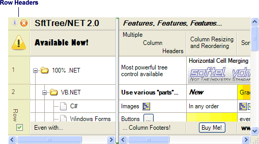
SftTree/NET 2.0 - Tree Control
Tickets
Hotfixes
- About
 On
On Off
Off