

A combo box control can display a row header for each item, an area at the beginning of the item that is not part of any column. Row headers can be displayed as buttons or as titles and can contain text and a picture. They are available for single- and multi-column combo boxes.
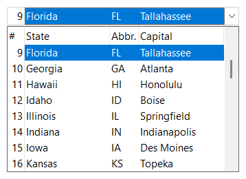
Row headers are shown once the row header area has a width. SetRowHeaderWidth defines the width in pixels and MakeRowHeaderOptimal sets the width so that the text and pictures of all row headers are completely visible (CalcOptimalRowHeaderWidth calculates this width without changing it). A width of 0, which is the default, hides the row headers.
SetShowRowHeader defines the row header display style, which applies to all row headers:
| SFTBOX_ROWSTYLE_NONE | No row headers. |
| SFTBOX_ROWSTYLE_BUTTONTEXT | Row headers are displayed as buttons, without default text. |
| SFTBOX_ROWSTYLE_TITLETEXT | Row headers are displayed as titles, without default text. |
| SFTBOX_ROWSTYLE_BUTTONCOUNT0 | Row headers are displayed as buttons. The row header text defaults to the zero-based index of the item. This is the default style. |
| SFTBOX_ROWSTYLE_TITLECOUNT0 | Row headers are displayed as titles. The row header text defaults to the zero-based index of the item. |
| SFTBOX_ROWSTYLE_BUTTONCOUNT1 | Row headers are displayed as buttons. The row header text defaults to the one-based index of the item. |
| SFTBOX_ROWSTYLE_TITLECOUNT1 | Row headers are displayed as titles. The row header text defaults to the one-based index of the item. |
SftBox_SetShowRowHeader(hwndBox, SFTBOX_ROWSTYLE_TITLECOUNT1); /* numbered row headers, starting at 1 */
SftBox_MakeRowHeaderOptimal(hwndBox, 0);                       /* as wide as needed */
If row headers are displayed as buttons, the button of the selected item is shown in its pressed position.
The row header text of an item is defined using SetRowText and can be retrieved using GetRowText and GetRowTextLength. With one of the "COUNT" styles, an item without row header text shows its item index.
SetRowHeaderStyle defines the alignment of the text within all row headers (ES_LEFT, ES_CENTER or ES_RIGHT, combined with SFTBOX_TOP, SFTBOX_VCENTER or SFTBOX_BOTTOM). SFTBOX_HEADER_DISABLED can be added to display all row headers as disabled, SFTBOX_HEADER_UP to have row header buttons return to their "up" position when clicked.
The colors and the picture of an item's row header are defined using SetRowInfo and the SFTBOX_ROW structure. GetRowInfo retrieves the current attributes, which are then modified and set using SetRowInfo. In a fixed height combo box all row header pictures must be the same height and width. In a variable height combo box, the row header pictures can be of varying height and width (see Fixed / Variable Height Items).
Row headers can show multiple lines of text (SetRowHeaderLines) and can use their own font (SetRowHeaderFont).
The row header of the selected item is also shown at the beginning of the static portion or edit control portion, with the same text, colors and picture. GetRowHeaderRect returns the location of an item's row header in the dropdown portion or, with an index of -1, the location of the row header in the static portion or edit control portion.
If the user clicks on a row header in the dropdown portion, the application receives a SFTBOXN_LBUTTONDOWN_ROW notification (SFTBOXN_LBUTTONDBLCLK_ROW for a double-click). The same notifications exist for the middle and the right mouse button. For the row header of the static portion or edit control portion, the notification code is wrapped using SFTBOXN_MAIN_NOTIFICATION.
The row/column header is the area where the row headers and the column headers meet. It is only shown if row headers and column headers are both shown (see Column Headers). The row/column header can display text (SetRowColText, GetRowColText, GetRowColTextLength) and a picture (SetRowColPicture).
SetShowRowColHeaderButton defines whether the row/column header is displayed as a button or as a title. SetRowColHeaderStyle defines the text alignment and can include SFTBOX_HEADER_DISABLED and SFTBOX_HEADER_UP. If the row/column header is a button, SetRowColHeaderButton defines whether it is shown in its pressed position.
A click on the row/column header sends the SFTBOXN_LBUTTONDOWN_ROWCOLUMN notification (SFTBOXN_LBUTTONDBLCLK_ROWCOLUMN for a double-click) and does not close the dropdown portion. GetRowColHeaderRect returns the location of the row/column header of the static portion (fMain TRUE) or the dropdown portion (fMain FALSE).

 On
 Off