

If the items of a combo box control form a hierarchy (see item hierarchy), parent items can be expanded and collapsed. Expanding a parent item makes its immediate dependent items (the items on the next lower level) visible. Collapsing a parent item hides all its dependent items on all lower levels. The combo box manages all items as one list and takes care of hiding and showing items as needed, so an application expands and collapses items without having to add or remove items.
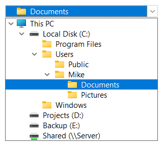
| Function | Description |
|---|---|
| Expand | Expands a parent item. The expand/collapse state of its dependent items, as saved by a previous call to Collapse, can be restored (fPreserve), or all dependent items on all levels can be expanded (fDepth). An index of -1 expands all items on level 0. |
| Collapse | Collapses a parent item and optionally saves the expand/collapse state of its dependent items (fPreserve). An index of -1 collapses all items on level 0. |
| SetItemExpand | Expands or collapses a parent item without preserving the expand/collapse state of its dependent items. When expanding, all dependent items on all levels can be expanded (fDepth). GetItemExpand returns whether an item is currently expanded. |
| SetItemExpandable | Marks an item without dependent items as expandable, so it is shown like a collapsed parent item. Using SetItemExpandable with FALSE deletes the item's dependent items. GetItemExpandable returns whether an item is expandable. |
In this example, all top level items are collapsed after the items have been added, then the dependent items of the first item are shown:
LONG i, count = SftBox_GetCount(hwndBox);
for (i = 0 ; i < count ; ++i) {
    if (SftBox_GetItemLevel(hwndBox, i) == 0)
        SftBox_Collapse(hwndBox, i, TRUE);
}
SftBox_Expand(hwndBox, 0, TRUE, FALSE);
When an item is added to a collapsed parent item, or when the level of an item is set and the item is not visible, its parent items are expanded automatically.
Expand/collapse buttons are optional buttons shown in front of parent items, which allow the user to expand and collapse items using the mouse. SetShowButtons enables the expand/collapse buttons for items on all levels except level 0 and SetShowButton0 enables the buttons for items on level 0. A new combo box does not show expand/collapse buttons.
SetButtons defines the appearance of the expand/collapse buttons, which is shared by all items. It accepts one of the following predefined button styles or the handle of a bitmap with the button images (see SetButtons). All predefined styles except SFTBOX_BUTTON_STDWIDE and SFTBOX_BUTTON_LARGE also enable the expand/collapse buttons for items on all levels except level 0, as if SetShowButtons(TRUE) had been called.
| SFTBOX_BUTTON_STANDARD | Small gray button with + and - symbols. |
| SFTBOX_BUTTON_STDWIDE | Wide gray button with + and - symbols. |
| SFTBOX_BUTTON_LARGE | Large gray button with up and down symbols. |
| SFTBOX_BUTTON_SIMPLE | White box with + and - symbols. |
| SFTBOX_BUTTON_MODERN | The button is not based on a bitmap, it is rendered by Windows. |
| SFTBOX_BUTTON_THEMED | A bitmap based button resembling a themed button. No actual Windows themes are used. |
| SFTBOX_BUTTON_AUTOMATIC, SFTBOX_BUTTON_AUTOMATIC2, SFTBOX_BUTTON_AUTOMATIC3 | The combo box selects a button style based on the Windows version and on whether Windows themes are used. |
SftBox_SetTreeLineStyle(hwndBox, SFTBOX_TREELINE_AUTOMATIC);
SftBox_SetShowButtons(hwndBox, TRUE);               /* expand/collapse buttons (level 1..n) */
SftBox_SetShowButton0(hwndBox, TRUE);               /* expand/collapse buttons (level 0) */
SftBox_SetButtons(hwndBox, SFTBOX_BUTTON_AUTOMATIC);
The combo box does not expand or collapse an item on its own when the user clicks an expand/collapse button. Instead, the parent window receives the SFTBOXN_LBUTTONDOWN_BUTTON notification (SFTBOXN_LBUTTONDBLCLK_BUTTON for a double-click) as a WM_COMMAND message and the application expands or collapses the item. GetExpandCollapseIndex returns the index of the item whose button was clicked. A click on an expand/collapse button or on the tree lines does not close the dropdown portion.
case SFTBOXN_LBUTTONDOWN_BUTTON:
case SFTBOXN_LBUTTONDBLCLK_BUTTON: {
    int index = SftBox_GetExpandCollapseIndex(hwndBox);
    if (index >= 0)
        SftBox_SetItemExpand(hwndBox, index, !SftBox_GetItemExpand(hwndBox, index), FALSE);
    break;
 }
The ItemImages sample (see Samples) handles the notifications this way. SetItemExpand is used in this example because it leaves the dropdown portion open. Expand, Collapse and the functions that add or delete items close the dropdown portion of a dropdown combo box or dropdown list combo box. An application that wants to use these functions while the dropdown portion remains open can suspend this behavior using the SftBox_RollupOnChangeOFF and SftBox_RollupOnChangeON macros (see SetRollupOnChange).
The SFTBOXN_LBUTTONDOWN_BUTTON notification is also sent when the user presses the Left arrow key on an expanded item or the Right arrow key on a collapsed parent item in a dropdown list combo box.
SetUpdateCaretExpandCollapse defines whether an item also becomes the selected item in the dropdown portion when its expand/collapse button is clicked.
An application does not have to add all items initially. It can add the parent items only and mark them as expandable using SetItemExpandable, without adding their dependent items. Such an item shows an expand/collapse button and the item picture of a collapsed parent item. When the application receives the SFTBOXN_LBUTTONDOWN_BUTTON notification for the item, it inserts the dependent items using InsertString and SetItemLevel, which also expands the item.
Tree lines connect the items of a hierarchy. SetTreeLineStyle defines whether and how tree lines are drawn. A new combo box does not show tree lines.
| SFTBOX_TREELINE_NONE | No tree lines. |
| SFTBOX_TREELINE_SOLID | Solid tree lines. Items on level 0 are not connected to each other. |
| SFTBOX_TREELINE_DOT | Dotted tree lines. Items on level 0 are not connected to each other. |
| SFTBOX_TREELINE_DOT0 | Dotted tree lines. Items on level 0 are also connected to each other. |
| SFTBOX_TREELINE_TRANSPARENT | Tree lines are not shown, but the layout is calculated as if they were present. This only affects the horizontal indentation of levels. |
| SFTBOX_TREELINE_AUTOMATIC, SFTBOX_TREELINE_AUTOMATIC0 | Same as SFTBOX_TREELINE_TRANSPARENT. |
The indentation of each level can be defined using SetIndentation and the color of the tree lines using SetCtlColors.
In a dropdown list combo box, the static portion shows the selected item indented according to its level and with its tree lines if the fStaticAligned member of the SFTBOX_CONTROL structure is TRUE, which is the default. If fStaticAligned is FALSE, the selected item is shown without indentation and tree lines.
The iMouseOverTransitionEffect member of the SFTBOX_CONTROL structure (see SetControlInfo) defines whether the expand/collapse buttons and tree lines become visible gradually when the mouse cursor enters the combo box and are hidden gradually when it leaves. Expand/collapse buttons or visible tree lines must be enabled, otherwise the setting has no effect. GDI+ support is required for transition effects.
| SFTBOX_TRANSITION_NONE | No transition effect is used. |
| SFTBOX_TRANSITION_THEMEDVISTAONLY_NOFOCUS | A transition effect is used when Windows themes are used and the combo box does not have the input focus. This is the default. |
| SFTBOX_TRANSITION_THEMEDVISTAONLY | A transition effect is used when Windows themes are used. |
| SFTBOX_TRANSITION_ALWAYS_NOFOCUS | A transition effect is used when the combo box does not have the input focus. |
| SFTBOX_TRANSITION_ALWAYS | A transition effect is always used. |

 On
 Off