Property Dialogs
Depending on the development environment used, the steps necessary to modify the control properties vary. The properties supported by the control can be displayed in a variety of ways. See your development environment's documentation for specific instructions.
Usually, development tools allow access to the Property Pages implemented by a control. For example, Visual Basic allows you to right-click on the control in design mode. By selecting Properties from the popup menu presented, the properties can be accessed using the Property Pages provided by the control. The following tabs are offered by this property dialog. Additional tabs may be added to the dialog by your development tool.
Each tab and associated page allows a set of properties to be manipulated. All properties are labeled using the property name. Detailed descriptions can be found in the on-line help.
Most pages offer on-line help by clicking on the Help button. This help button may not be displayed when using certain development environments. Other means may be available to view the product's on-line help.
Help
By right-clicking on the property page, help information for a specific property can be accessed.
Most pages offer on-line help by clicking on the Help button. This Help button may not be displayed when using certain development environments. Other means may be available to view the SftBox/OCX on-line help.
Property Pages
There are two types of property pages.
Property List
The first, simpler type shows a number of properties using categories (such as Appearance, Behavior, Colors, etc.).
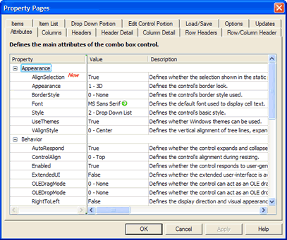
By clicking on a property, the property can be edited. Using the TAB (or SHIFT+TAB) key the next (or previous) property can be edited or simply click on another property.
Double-click on the description of a property to display the complete help information or right-click on the property dialog for a help menu.
Property Grid
The second property page type displays multiple objects, all of the same type. Each item (or line) in the grid represents one object. The following shows the Header Detail page. Each line represents one SftBoxHeader object, indexed by column number. The index is shown at the beginning of the item (a gray button with the index number).
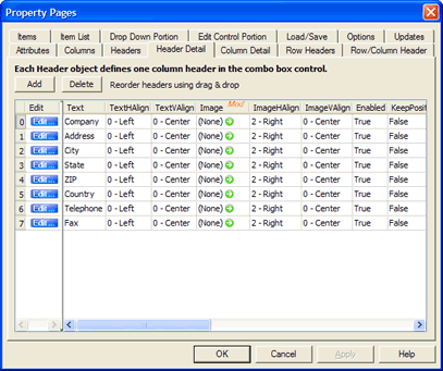
As before, columns can be resized and properties are edited by clicking on them.
In addition, the objects can be reordered. By clicking on the button on the left of each item and dragging it to a new position, the object and its properties are moved to another position.
Click on a column header to display the complete help information for the selected property or right-click on a specific property for a help menu.
Color Properties
When clicking on a property representing a color value, a combo box is displayed which shows the available system colors as defined using Control Panel and also the basic colors. A new color value can be selected from the choices offered or a new color value can be entered. The following syntax is accepted:
| Syntax | Description |
|---|
| &H00bbggrr& | A hexadecimal number (Visual Basic style) |
| 0x00bbggrr | A hexadecimal number (C/C++ style) |
| decimal | A decimal value, the decimal equivalent of a hexadecimal color value |
| |
| where | bb = blue component
rr = red component
gg = green component |
| |
| Example: | &H00FF0000& (Blue) |
| 0x0000ff00 (Green) |
Example
&H00FF0000& Blue
0x0000ff00 Green
Image Properties
An image property (based on a SftPictureObject object class) can be defined by clicking on the  bitmap of the cell. This displays a dialog that is used to load a bitmap, GDI+ image, icon or metafile, built-in image or color sample. Some properties only allow bitmaps or only icons.
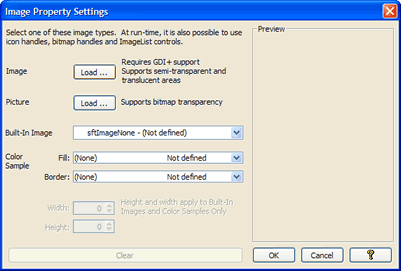
If a file has been loaded, the image is saved along with the control properties and the file is no longer required.
Image properties display (None), (GDI+ Image), (Picture), (Built-In), (Color Sample) or (Invalid Type), depending on the graphic type loaded.
To clear an image property click on the bitmap of the cell, then click Clear on the resulting dialog. This will clear the image property.
Picture Properties
A Picture property can be defined by clicking on the bitmap of the cell. This displays a dialog that is used to load a bitmap, icon or metafile. Some properties only allow bitmaps or only icons.
Once a file has been loaded, the image is saved along with the control properties and the file is no longer required.
Picture properties display (None), (Bitmap), (Metafile), (Icon) or (Invalid Type), depending on the graphic type loaded.
To clear a Picture property click on the bitmap of the cell, then click Cancel on the resulting dialog. This will clear the Picture property.
Font Properties
A Font property can be defined by clicking on the bitmap of the cell. This displays a dialog that is used to define the attributes of the font.
Certain font properties also support the use of a default font. To restore the default font, right-click on the bitmap of the cell and select the Reset menu entry.
 On
On Off
Off