Button Label
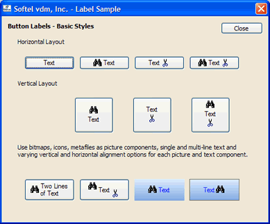
A button displays a button label, which consists of an optional text component and two optional picture components.
Text Component
The Text property defines the control's caption. One single line of text or multiple lines are possible. The text portion can also define an accelerator key using an embedded & character. If the text component is clipped horizontally, the text is truncated and the characters "..." are displayed at the end of the truncated text. If the text component is clipped vertically, no special processing occurs.
Picture Components
The properties Image1 and Image2 define optional picture components. Each can define a bitmap, icon, GDI+ image, Windows metafile. Icons, animations and Windows metafiles define transparent images and will be displayed properly within the button. The Image1Hover and Image2Hover properties are used if the mouse cursor is located on the control or picture component, Image1Pressed and Image2Pressed are used if the button is pressed or Image1Disabled and Image2Disabled are used if the control is disabled (see Enabled property). Otherwise, the Image1 and Image2 properties are used to determine the displayed graphics.
Properties
The button label of a button is defined using the following methods and properties:
| Property/Method | Description |
|---|
| AVIPlay | Defines the animation used as a button picture component. |
| AVIPlayResource | Defines the animation used as a button picture component. |
| Image1 | Defines the first graphic. |
| Image1AlignHorz | Defines the horizontal alignment of the first graphic. |
| Image1AlignVert | Defines the vertical alignment of the first graphic. |
| Image1Disabled | Defines the first graphic when the button is disabled. |
| Image1Hover | Defines the first graphic when the mouse cursor is located on the control. |
| Image1Pressed | Defines the first graphic when the button is pressed. |
| Image2 | Defines the second graphic. |
| Image2AlignHorz | Defines the horizontal alignment of the second graphic. |
| Image2AlignVert | Defines the vertical alignment of the second graphic. |
| Image2Disabled | Defines the second graphic when the button is disabled. |
| Image2Hover | Defines the second graphic when the mouse cursor is located on the control. |
| Text | Defines the control's caption. |
| TextAlignHorz | Defines the horizontal alignment of the text. |
| TextAlignVert | Defines the vertical alignment of the text. |
Orientation
Two basic button label styles are available, defining the basic orientation of the text and picture components (Orientation property):
 | Horizontal Orientation |
 | Vertical Orientation |
Once the orientation is chosen, the relative position of each component (Image1, Text, Image2) is defined using the alignment properties Image1AlignHorz/Image1AlignVert, TextAlignHorz/TextAlignVert and Image2AlignHorz/Image2AlignVert.
Horizontal Orientation
The horizontally available empty space between the components Image1, Text, Image2 is distributed based on each component's alignment property setting. First, Image1 is aligned horizontally using the Image1AlignHorz property, then Text is aligned within the new remaining space using the TextAlignHorz property, followed by Image2 which is aligned within the remaining space using the Image2AlignHorz property. The vertical alignment is defined using the properties Image1AlignVert, TextAlignVert and Image2AlignVert.
If a component is empty or not defined, its alignment settings have no effect.
Vertical Orientation
The vertically available empty space between the components Image1, Text, Image2 is distributed based on each component's alignment property setting. First, Image1 is aligned vertically using the Image1AlignVert property, then Text is aligned within the new remaining space using the TextAlignVert property, followed by Image2 which is aligned within the remaining space using the Image2AlignVert property. The horizontal alignment is defined using the properties Image1AlignHorz, TextAlignHorz and Image2AlignHorz.
If a component is empty or not defined, its alignment settings have no effect.
 On
On Off
Off